this month’s rue magazine blew a gluten-free scent of humility back into the visual stinkbomb of tycoon-income art collections and summer homes i’ve been suffering for a couple days now.
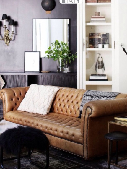
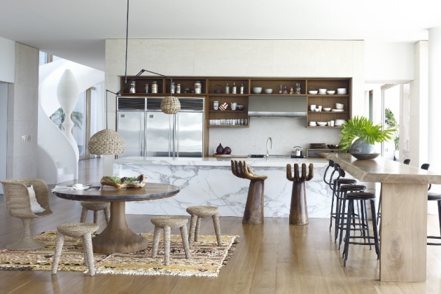
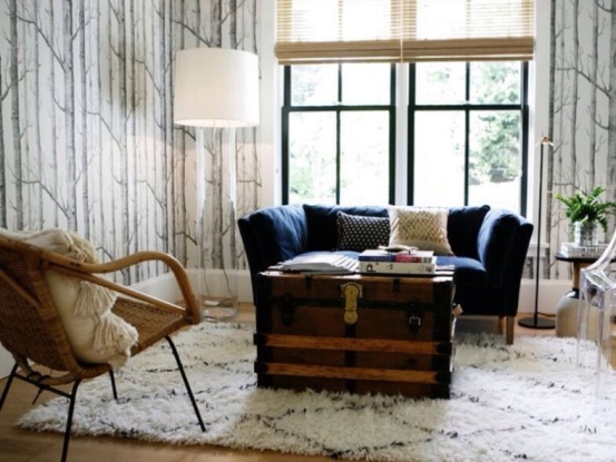
berkus and brent / rue magazine / nov 2013

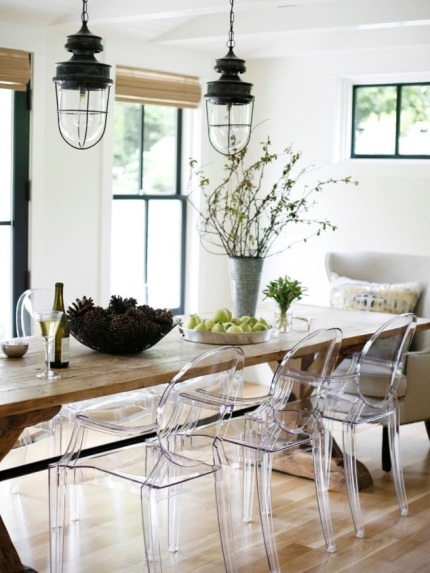
alexandra kaehler / rue magazine / nov 2013

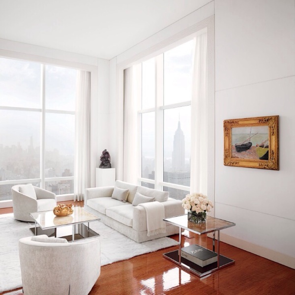
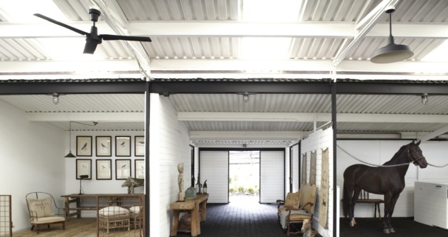
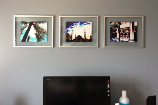
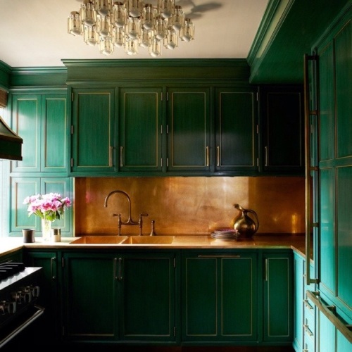
paul and katie hackworth / rue magazine / nov 2013
paul and katie hackworth / rue magazine / nov 2013
paul and katie hackworth / rue magazine / nov 2013

berkus and brent / rue magazine / nov 2013

berkus and brent / rue magazine / nov 2013
after the relief, though… (dare i say it–) boredom?
to be hip is to achieve aesthetic perfection whilst maintaining the appearance of not giving a fuck. forget coordinating paints, matching woods, buying furniture sets, or showing any outward signs of luxury. marble floor? rip that shit up and turn the broken slabs into a makeshift barcart/island on which you scrape and fold your homemade artisanal fudge to sell at the weekend pop-up market.
this works in a nineteenth century factory with bricks and woods and metals and other rad textures. this works on teenage runway models with long, slender, perky everything.
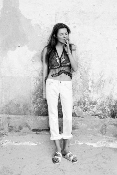
this is why you can put dirty white jeans + birkenstocks on kate moss or a broken elementary school desk + succulent in an empty barn and call it design. when those guys with good bones don’t try, their natural state pwns.
the same how-to guide leaves rest of us looking destitute.
so we of the tallest bell curve bits lean on tailored jackets to hide the lumps and sequined throw pillows to hide the mcmansion. hip is a club as inaccessible as the one percent.
what is it about ‘trying too hard’ that makes us recoil? is it a fear of things sincerely, not ironically, old-fashioned?
imagine the chateau de chambord – now empty of all but stone walls – filled with jewel-tone velvet upholstered louis XVI chairs, dramatic narrative tapestries, plaster cast dragons dressed in hand painted golden scales.

chateau de chambord / aug 2013
some modern day fool rolling through (me?) would likely plop an eames rocker on a brown cowhide rug by the fireplace and pitch it to a magazine.
which is better? (more on my gal chambord, later.)
i read a thought-provoking piece this week by fashion blogoddess leandra medine about her underdressing habit sparked by a traumatic tweenage overdressing to a bat mitzvah.
we the plebes chronically underdress our spaces in the pursuit of cool. earlier this year, i had hoped that gatsby-era sparkle might make a return with movie hype via the likes of kelly wearstler. sure enough, who should enlist her but what?me?pretty? posterchild cameron diaz.

kelly wearstler / elle decor / oct 2013

kelly wearstler / elle decor / oct 2013
kelly wearstler / elle decor / oct 2013

kelly wearstler and cameron diaz
when flannel-and-toes diaz asks for sparkle-and-shine in her home, it’s time to rethink reclaimed wood as the muse of hip irreverence.
waiting for the change. watching you, rue.